


%2520(1).png)
Depending on the complexity of a project, designing and developing a website can take weeks or even months. During that time, the design of a website will go through many edits and iterations before it is completed. Because of this, many clients might be surprised to discover that much of the project will be designed in Figma before making its way over to Webflow. Both Webflow and Figma are powerful tools, and when used together, drastically improve the web design process. Let’s break down why Webflow designers use both Webflow and Figma and where both are utilized during the website design and development process.
Webflow vs Figma In the Web Design Process
Before a website is built in Webflow, it is first designed in Figma
Figma is a web application used to design interfaces. As an all-in-one design tool, Figma is primarily used by UX/UI designers during the web design process to prototype websites. The software is collaborative, so many people can work on a project at the same time.
On the other hand, Webflow is a no-code web development platform. What sets Webflow apart from its competitors—like WordPress—is the visual page builder tool. Using a drag-and-drop feature to design a website, as websites are built, Webflow automatically writes clean, semantic code. While there’s no need for custom development to build websites, Webflow supports custom development for more complex features that may not be available through the visual page builder.
Since both Webflow and Figma can be used to design websites, why are both used in the process? Well, Figma is typically used to develop early wireframes and prototypes of websites. Most designers opt to use Figma to prototype websites because of how many edits are needed during the process. Using Figma, designers can show multiple versions or iterations of a prototype to a client in a way that’s much easier to digest. Because the software is collaborative, designers can share a link with clients, and comments on the design can be made right on the page. It’s much easier to make those changes on a Figma design as opposed to mocking up a website in Webflow and making changes as needed. Once a prototype is approved and finished, the Figma file is handed off to web developers who will then bring the website to life. This process allows developers to keep a clean design system and naming conventions since edits aren’t made where the code is written.
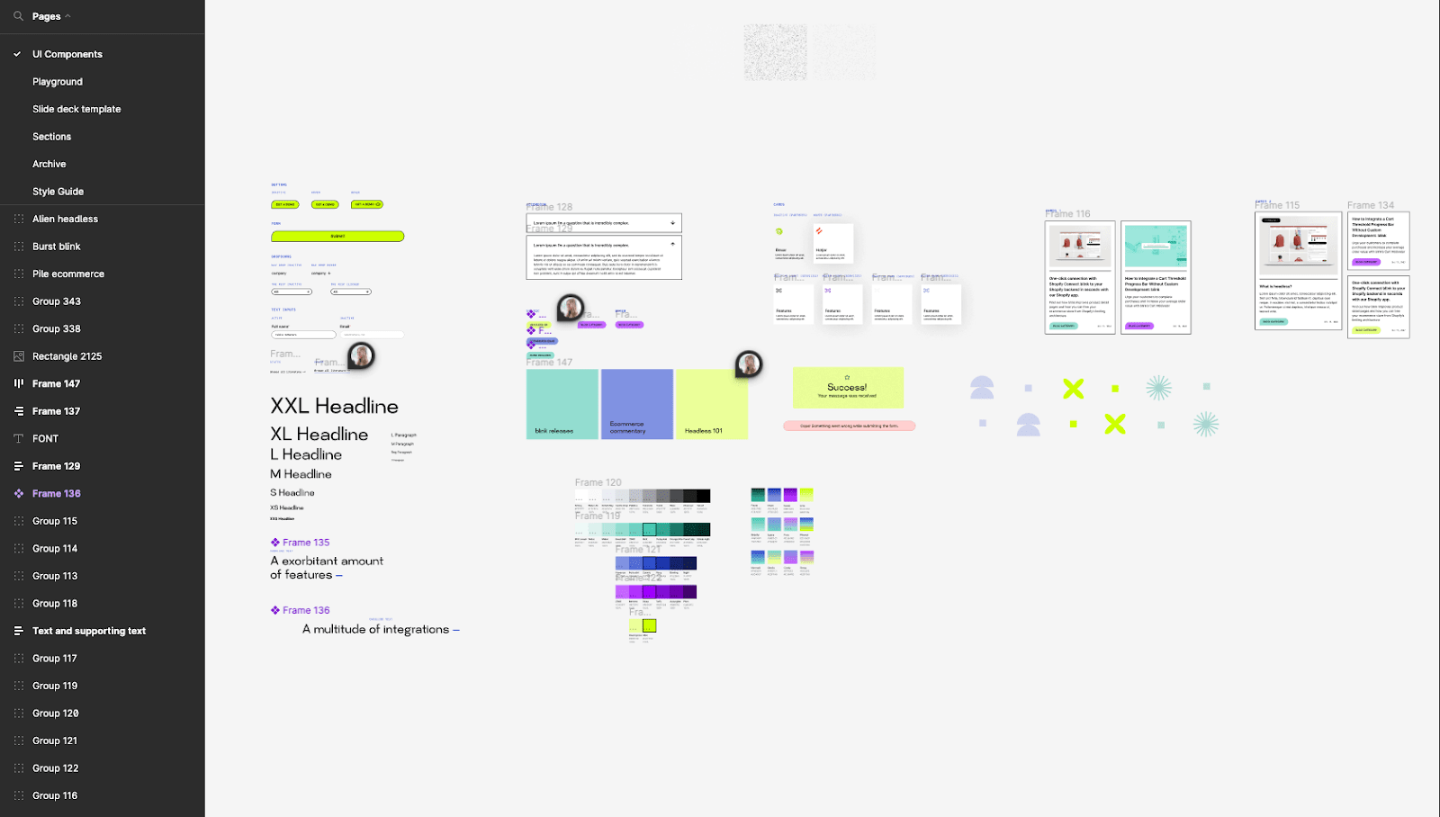
The Process of Designing Prototypes in Figma
From wireframing to prototyping, Figma is the best resource to use when designing websites
From start to finish, there will always be many iterations and edits to any website build. From the very beginning processes of brainstorming ideas to actually creating a website prototype, Figma is one of the best tools to use for every step of the design process. Up until the design is approved for development, Figma is the go-to tool for creating and editing website designs.
Whiteboard tool for brainstorming
Before jumping into designing, many designers use Figma’s FigJam whiteboard tool to brainstorm ideas for the project. With tools like sticky notes and voting, initial ideas can be jotted down and teammates can collaborate on ideas. As designers do their initial research, their findings can be collected and organized on the FigJam file to refer back to as they start their design process. One of the most valuable capabilities in FigJam is the ability to diagram in the file. This diagram tool can be used to map user flows and systems so designers can establish these before digging into the design. FigJam and Figma files can be connected so that both can be referred to at any time.
Style guide creation
Figma can additionally be used to create style guides. Should a designer be working off of an already existing style guide or creating a new one from scratch, many designers opt to keep a style guide in the Figma file they are working on so that it can be accessed at any time by any team member while designing. Figma also has great plugin tools available to make a comprehensive style guide. Plugins can be used to generate color shades for style guide color categories. Typography files can be uploaded and plugins can be used to create fonts as styles to be used later. Icons can be found through plugins or uploaded from other sources. Figma can also be used to set up grid layouts, design input fields, and set the standard for many other UX/UI elements found in a typical style guide.
Wireframe Website
Before getting into the nitty-gritty of the final details, designers wireframe websites to serve as a framework for the rest of the project. Wireframes are meant to be as simple as possible, giving just enough detail so that clients understand the flow and structure of the site. This way, functionality and usability can be the primary focus of early conversations as opposed to the aesthetics of a website.
More often than not, wireframing will start with a low-fidelity mockup. In this type of wireframe, the design uses basic shapes, like circles and squares, to represent UI elements and website content. Low-fidelity wireframes are so simple that they could realistically be done with pen and paper, but designers opt to use Figma instead because of how easy it is to share the document.
After creating a low-fidelity wireframe and getting some feedback from the client, designers will then mock up a high-fidelity wireframe. Where low-fidelity wireframes are really the bare bones of a project, high-fidelity wireframes are where a bit more detail gets added to the design. In this stage of the project, style guide elements like fonts, colors, and elements are added to show more of the brand personality. Images may or may not be added at this point, but in the case they are not added, designers still use basic shapes in order to visually piece together the design without those assets.
Website Mockup
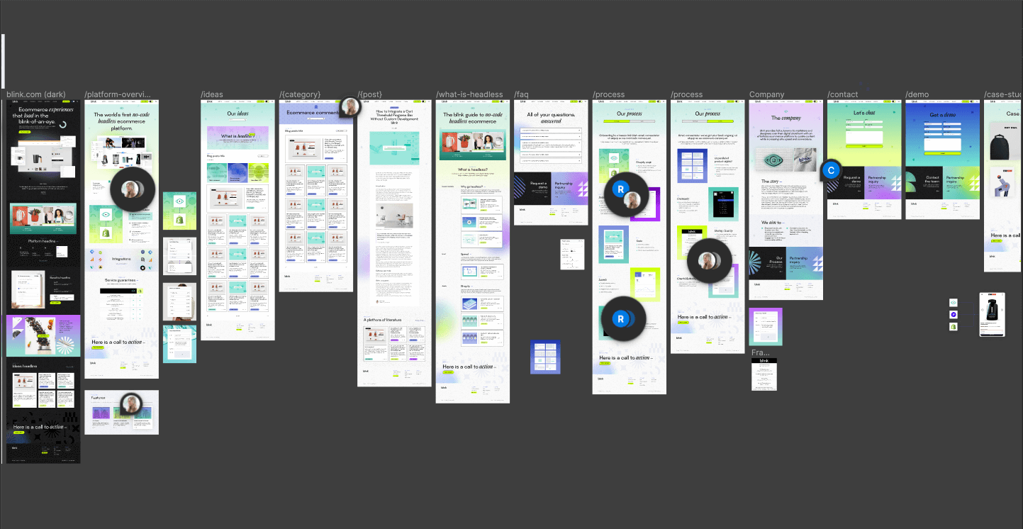
As the content of the website and the wireframe are more clearly defined, websites can be entirely mocked up in Figma to show a dynamic version of the website before it is built on Webflow. Designers will add the content, set interactions between pages, create sections, add calls to action, and design anything else that’s needed. After the first draft of the prototype is completed, the client is given the opportunity to note places of change while actually being able to see what the website will look like. After final changes and edits are made and the design is approved, it’s then time to hand it over to developers to actually create the website. With Figma’s comment feature, the designer can easily add annotations or comment back and forth with developers if they have questions.
Bringing a Figma Prototype to Life In Webflow
After a Figma website prototype is approved, it’s then handed off to developers to build in Webflow

Webflow is an intuitive web development tool that makes it easy to build websites. However, as we discussed before, the back-and-forth edits that are to be expected during the design process are much better handled on Figma as opposed to Webflow. With an approved design, it’s a simple process to bring the mock-up to life in Webflow.
Create and Set Global Styles + Style Guides
After the Figma design is approved, the first step to creating the website in Webflow is to create a new project. With this completely blank slate, the designer will then create and set global styles and style guides. This is when all of the default settings of the site are established. At this step in the process, paragraph styles, headings, and link appearances are all established. This would also be the time that any custom fonts are uploaded and any custom colors are added to the project to use later. Really, this portion of the website build defines the basics to make managing the style of a website easier down the line.
Export Figma Assets
After laying the foundation by setting global styles, the next step in the Figma-to-Webflow process is to export all of the assets used in the Figma file. Before adding the files to the Webflow project, it’s best practice to compress any assets. Developers can convert files to Webp directly in Webflow. This keeps the size of the files on the website smaller, thus leading to a much faster website experience. After the files are downloaded and compressed, the designer will either drag the assets into Webflow or upload the files into the assets panel to use later.
Create Div Frames
With all of the website assets in order, the developer will use Div blocks, sections, containers, and grids in the Webflow project to replicate groups of content and frames in the Figma design. Div blocks are commonly used to group elements together to keep things organized and all of the other tools used act as building blocks for the layout. Each Div is given a unique class name, which, again, is used to organize the project and the content within the build.
Style Content
After the developer uses Div frames to establish where groups of content will be placed, they will then add the actual content and begin to style it in Webflow. This is the biggest lift of the project and where some changes to the Figma design may happen in the layout to make content easier to actually implement. Design tools and code tend to behave differently, so what may have worked perfectly on Figma may not work or look the same on Webflow. Because of this, small changes to the site may have to be made for the website to function properly.
Add Interactions + Integrations
With the content added and styled, it’s time to add a bit of spice to the design. Website animations and motions, like scroll-based movement, hover animations, and on-click interactions, help make the website more interactive and can draw visual attention to different parts of the website. Webflow gives designers the ability to design interactions and integrations natively.
Adjust Your Mobile Design
As the website is built, it will be designed for desktop first and then adjusted for a mobile experience. The desktop version of the website is built as the master component. The elements defined, like padding and flex properties, can flow to adjust to a smaller rendering but falter when stretched. So, if sites were to be designed for the mobile rendering first on Webflow, the rendering of the desktop version would look, well, wonky.
Publish + Test
Once the designer is happy with the rendering of the website in The Designer tool in Webflow, it’s time to publish, test, and update the design until it is up to standards. All designers and developers have different QA processes, but in general, it’s a good idea to check the website on various devices and browsers to see that it not only looks right but it works right, too. As any issues are noted, the designer will go back into Webflow to make the proper adjustments. The process is repeated until the site is thoroughly checked and any issues are corrected.
While it may be commonly assumed that a Webflow website is designed and built using only Webflow, that’s normally not the case. Because of how many edits and revisions a website project takes, exclusively using Webflow would make the design process much longer than it needs to be. With interactive and collaborative design tools, like Figma, the process is made to be much more efficient. Both Webflow and Figma play a big role in any website project, and when they are used together, they simplify the process entirely.
As Webflow experts, we at Responsival use Webflow and Figma for every website we build. If you’re looking for a company with expertise in designing and developing Webflow websites, look no further. Schedule a call with our team to talk about your upcoming Webflow project to see how we can help.

.jpg)
