1. Appearance
Of course, web design impacts your user’s overall experience. After all, how your site looks plays a huge role on whether it is taken seriously or not. Overall, sites nowadays can be separated into two broad groups: The first are sites that have an archaic design and look like they were created in the 1990’s. The second, and better, group are more common nowadays: These sites are sleeker and adhere to modern design standards. Modern web design standards--and trends--include the following traits:
- Responsive design: Is using code on your site that makes it look and function the same, regardless of the device someone uses to access it (be it on a smartphone or computer).
- Parallax scrolling: Is overlaying two visual elements on a page and moving them at different speeds as someone scrolls.
- Big, bold fonts: This concept refers to using sans-serif typefaces that are easy to read on screens. It makes your customer experience smoother, and it lets your readers get the most value out of every sentence on your site.
- Eye-catching “hero” images: These images are giant, full-width graphics at the top of articles that give you a summarizing visual representation of the text below. They got the name “hero” because these images champion the article with which they’re associated. They’re great for generating clicks for social media, and they’re ideal introductions to concepts on your site.
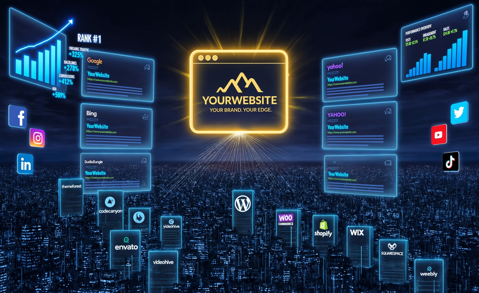
- Multimedia: Refers to images, videos, interactives, and other visual elements that help break up text and educate your visitors. Multimedia is fair game for just about any page on your site from a blog post to a 100-page downloadable guide. When you include it, you make your content much more scannable, engaging, and enjoyable for readers.
2. Professionalism
First impressions mean a lot. And having a professional looking website before visitors even read a word is really important. When someone arrives on your site, you want them to realize that you’re a respectable company/business/blog. This impression, though, is largely based on how your web design. Below are some web design elements that help you look professional:
- A culture/about page: This is the part of your site that’s exclusively dedicated to talking about your company’s approach to daily operations. It tells visitors what you do and how you do it.
- Photos of staff: Photos are important in reinforcing professionalism. If your company's workers look and act professional, then visitors are more likely to think highly of your website.
- Customer results: The proof is in the pudding. Quantifying your work shows you have experience and that you produce results for your customers, which is all that really matters.
3. Load Time
If someone has to wait for a page on your site to display for a long time, they can grow frustrated. Also, load time is a major Google ranking factor, and a fast load time has become crucial to online success as more consumers move toward using the Internet on mobile devices.
How can you reduce your site’s loading time?
- Optimize image sizes: Use .jpg files for your images. This is the best way to show high-resolution photos or graphics while minimizing the size of the file.
- Remove auto-play multimedia: Removing this means your users won’t use big chunks of their mobile data when they go to your site on their smartphones. Plus, auto-play multimedia is an irritating way to promote content anyway. Most users will leave your page if they get there and there’s automatically a video in their face.
4. Clarity
If a website is too confusing, users will give up on it. That’s why designing your website so visitors can find what they want as quickly as possible is so important. Improving website navigation time keeps viewers intrigued and not frustrated, so here’s a few navigation tips.
- Breadcrumb: This navigation style is inspired by the story of Hansel & Gretel. Whenever someone clicks to a new page, your site automatically adds their previous page to a navigation bar. Then, a user can click back to that page in an instant if they want. In a particularly complex website, this feature helps people not get lost.
- Drop-down menu: A drop-down menu lets someone hover their cursor over a menu title and see the pages that category contains. Then, they can click on the page that interests them to get the information they want.
5. Conversions
Arguably, conversions are the most important part of web design. Your business won’t thrive online without them. Web design can impact conversions in a thousand different ways, and they’re all important, but these three are some of the most impactful:
- Color: In web design, color refers to a color scheme that intelligently uses contrast to highlight selling propositions. If you’re using a cool color scheme, use warm colors like red or yellow for your calls to action. That helps them stand out so people can find them more easily and convert.
- KISS principle: This is an acronym for “Keep It Simple, Stupid.” The idea is that simpler designs are better designs. When you have an easy-to-follow, organized website, you make it that much easier for visitors to convert.
- Faces: Simply put, human faces help visitors relate to your business. You could use stock images, but this works best when you use your own staff. Essentially, you show someone the human side of your company to make them feel more comfortable contacting you.